
Chart & Diagram
- Format
- Static, Video
- Category
- Proof / Education
- Stage
- MOF, BOF
- Requires
- Numbers you can source
What is it
The ad built around a single chart: a growth curve, a comparison of lines, a before-and-after bar, a simple flow diagram. The headline asks or claims something, and the chart answers it visually. People trust a line going up more than a sentence saying things go up. A chart looks like evidence even before anyone reads the axis labels, which makes it one of the few formats that persuades analytical buyers without feeling like a pitch.
What makes it work
One chart, one takeaway
The viewer should get the point in under two seconds without reading a single label: it grows, it compounds, ours is higher, the gap widens. If the chart needs a legend to be understood, it's a report, not an ad. Cut series and gridlines until the shape alone tells the story.
The headline asks, the chart answers
"Where could £200 a month take you?" sets up a question that only the curve can resolve. That handoff pulls the eye from the type down into the data. A headline that already states the conclusion makes the chart decorative.
Label the points that matter, not every point
Three or four value callouts at the milestones the viewer cares about: year 5, 10, 20, or the final number. Bold, high contrast, in pills or tags sitting on the line. Everything else can stay at small axis-label size.
Use colour to signal "yours"
When there are several lines, one should clearly be the product, in the brand accent. The others stay muted. Four equally loud lines turn the chart into noise, and the reader can't tell which one they're supposed to want.
Make it look like it came from a real tool
Clean axes, sensible increments, a believable curve shape. Exaggerated hockey sticks and unlabelled axes are the visual shorthand for made-up data, and experienced buyers read them that way instantly.
The footnote is part of the design
Assumptions, return rates, data source, "not a guarantee of performance." For finance, investing and anything income-related this is mandatory on Meta and under most regulators, including the FCA and BaFin. Give it a proper footer band rather than squeezing it in; it reads as honesty rather than fine print.
Credibility lines beat borrowed logos
A short line underneath ("built by a former aerospace engineer," "based on 2.4M orders") adds authority. Using a real institution's logo implies an endorsement you don't have, and it's the part most likely to get flagged.
Reference 1
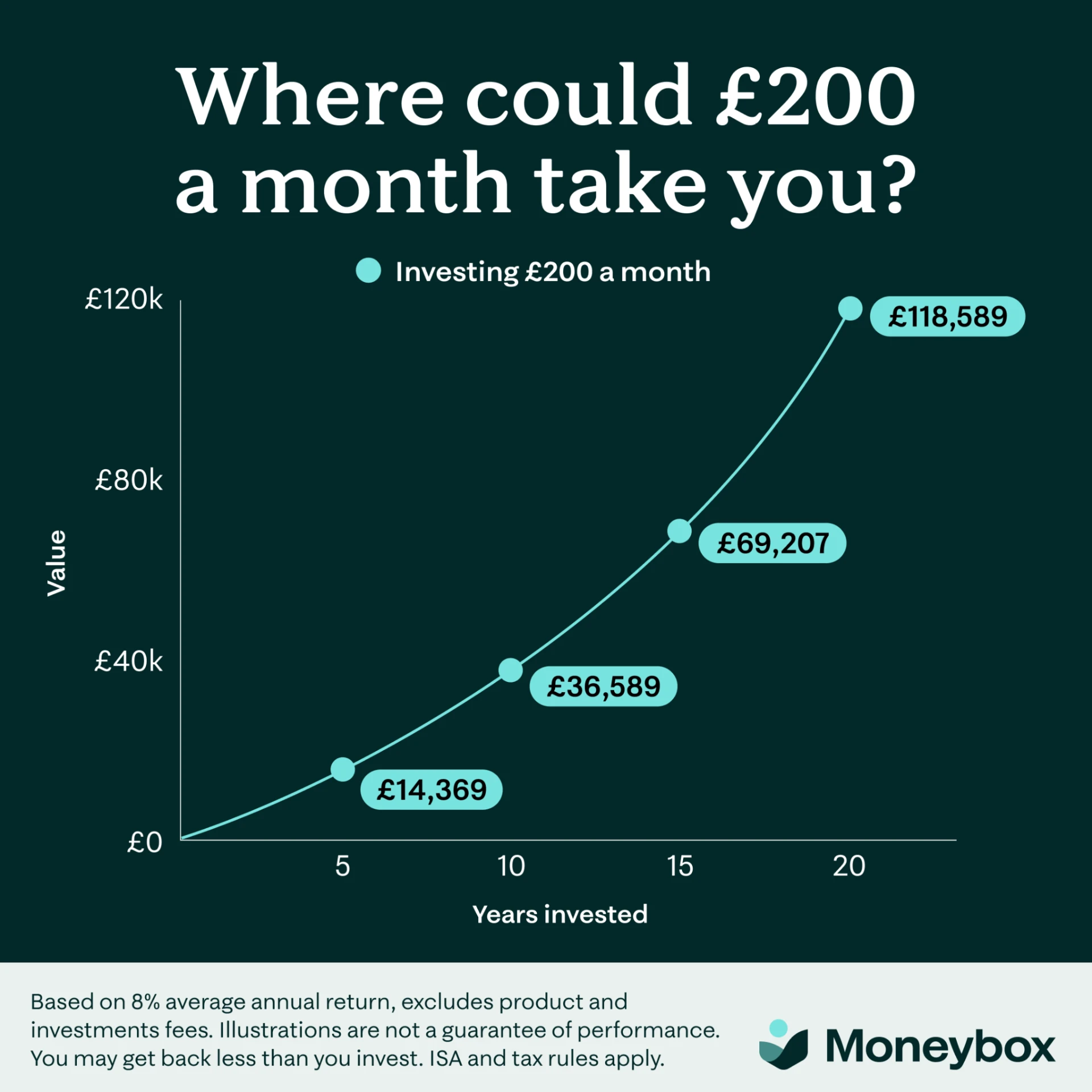
AI Edit Master Prompt
Using the attached image as the layout reference: keep the solid deep dark background filling the upper four fifths, a large bold serif headline in white on two centred lines at the top, and beneath it a small legend with a single coloured dot and a bold label. Below that keep a clean line chart with thin white axes, a rotated y-axis title on the left, four value ticks up the side and four year ticks along the bottom with an axis title beneath, a single smooth upward-curving line in a bright accent colour, and four circular markers along the line, each with a rounded pill-shaped callout in the same accent colour holding a bold dark figure. Across the bottom fifth keep a light-toned footer band with three lines of small regular-weight disclaimer text on the left and the logo with wordmark on the right. Set the headline to "{THE QUESTION ABOUT THE OUTCOME}", the legend to "{THE INPUT BEING MODELLED}", the axis titles to "{THE VALUE UNIT}" and "{THE TIME UNIT}", the four callouts to "{FOUR MILESTONE FIGURES}", the disclaimer to "{YOUR ASSUMPTIONS AND RISK WARNING}", and the wordmark to "{YOUR BRAND}".Reference 2
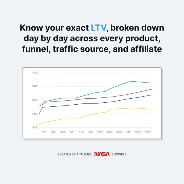
AI Edit Master Prompt
Using the attached image as the layout reference: keep the flat pale grey background, a bold dark sans-serif headline on three centred lines at the top with one keyword picked out in a bright accent colour, and beneath it a white rectangular chart panel with a thin dark border and a soft offset drop shadow. Inside the panel keep a multi-line chart with faint dashed horizontal gridlines, small grey value labels up the left side, small grey interval labels along the bottom, and four thin coloured lines trending upward at different levels with no legend. At the bottom keep a single small all-caps credibility line centred, with one word set as a coloured wordmark. Set the headline to "{WHAT YOU'LL KNOW} {THE KEYWORD}" with {THE KEYWORD} in the accent colour, the axis labels to "{YOUR VALUE SCALE}" and "{YOUR TIME INTERVALS}", and the credibility line to "{YOUR CREDENTIAL}" with "{THE HIGHLIGHTED WORD}" in colour.Reference 3
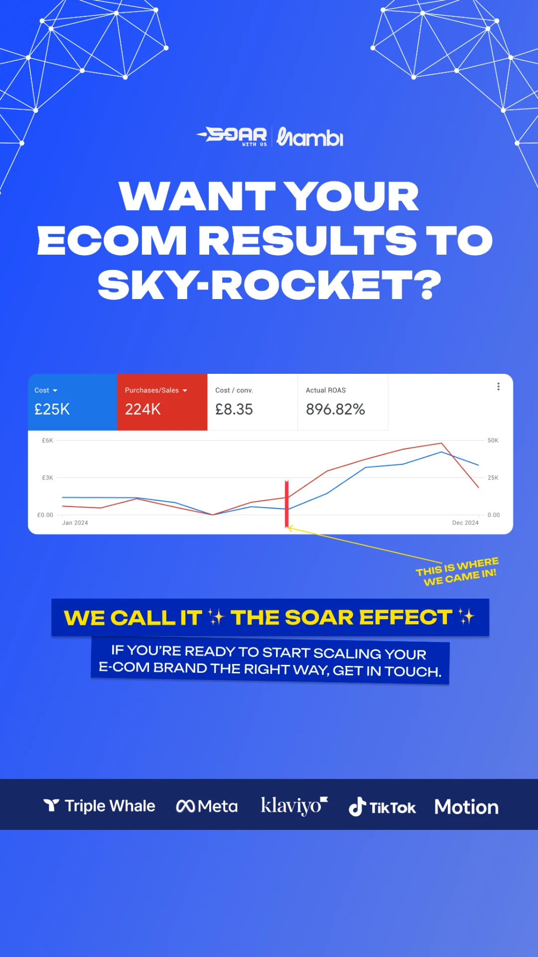
AI Edit Master Prompt
Using the attached image as the layout reference: keep the vivid blue gradient background with faint white geometric line-and-node network patterns in the top corners, a small white co-branded logo lockup centred near the top, and a very heavy extended all-caps white headline on three centred lines beneath it. In the middle keep a white rounded card styled as an analytics dashboard screenshot: a row of four metric tiles across the top, the first two filled in solid contrasting colours with white text and the other two white with dark text, each holding a small label and a large figure, and beneath them a two-line chart with faint gridlines, small axis labels and start and end date labels, both lines flat on the left and climbing sharply on the right. Keep a bold red vertical marker on the chart at the turning point, with a thin yellow line running from it to a small tilted handwritten-style yellow all-caps annotation below the card on the right. Beneath that keep a dark blue banner with a heavy all-caps yellow line flanked by sparkle emojis, a slightly rotated second dark blue banner with a two-line all-caps white CTA beneath it, and a full-width dark navy strip near the bottom holding a row of white partner or tool logos. Set the headline to "{THE RESULT QUESTION}", the four tiles to "{FOUR METRIC LABELS}" and "{FOUR REAL FIGURES}", the dates to "{START DATE}" and "{END DATE}", the annotation to "{WHERE WE CAME IN}", the yellow banner to "{YOUR NAMED METHOD}", the CTA banner to "{THE INVITATION}", the logo lockup to "{YOUR LOGO AND CLIENT LOGO}", and the logo strip to "{PLATFORMS YOU ACTUALLY WORK WITH}".Reference 4
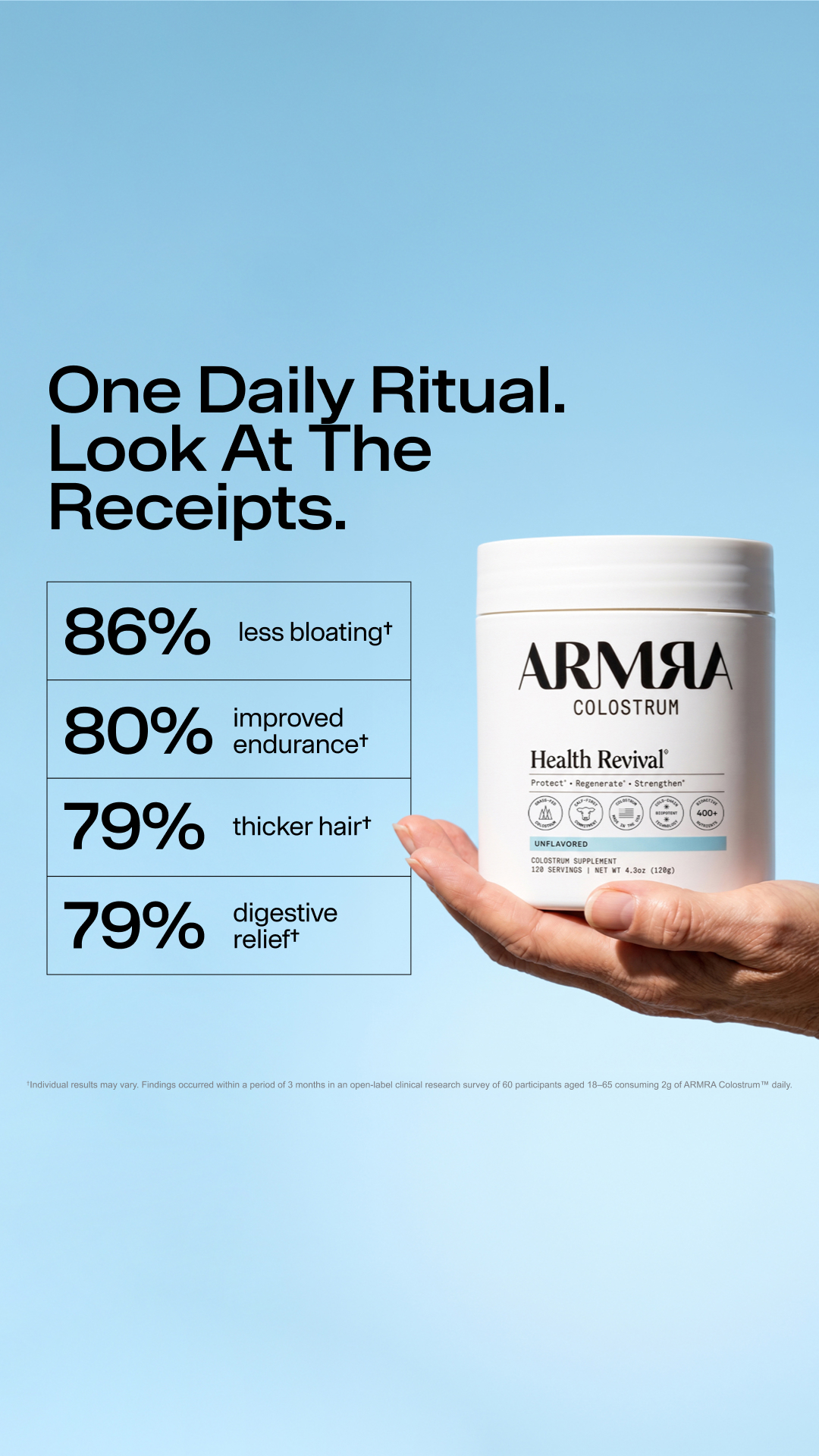
AI Edit Master Prompt
Using the attached image as the layout reference: keep the soft sky-blue gradient background fading lighter toward the bottom, a large black geometric sans-serif headline on three left-aligned lines in the upper left, and beneath it a stacked table of four equal rows with thin black outlines, each row holding a very large black percentage on the left and a short one- or two-line result in regular weight on the right, ending in a small dagger symbol. On the right keep a real hand entering from the right edge, palm up, holding the product so it overlaps the table's edge, lit with bright natural daylight. Near the bottom keep a single line of very small grey footnote text spanning the width. Replace the product with {YOUR PRODUCT}. Set the headline to "{THE RITUAL} {THE PROOF LINE}", the four rows to "{FOUR STUDY PERCENTAGES}" with "{FOUR MATCHING RESULTS}", and the footnote to "{STUDY DESIGN, SAMPLE SIZE, DURATION AND 'RESULTS MAY VAR Y'}".