
Moodboard
- Format
- Static, Carousel
- Category
- Brand / Aspiration
- Stage
- TOF, MOF
- Requires
- A consistent visual world
What is it
Several images arranged in a grid, collage or mosaic that together show the feeling of owning, using or belonging to the product rather than the product alone. Materials, spaces, hands at work, people in the moment, details up close. It works the way a Pinterest board works: the viewer doesn't evaluate one image, they step into a mood. That makes it one of the few formats that sells taste, lifestyle and craft without a single claim, and it reads as curated content rather than advertising.
What makes it work
One palette across every tile
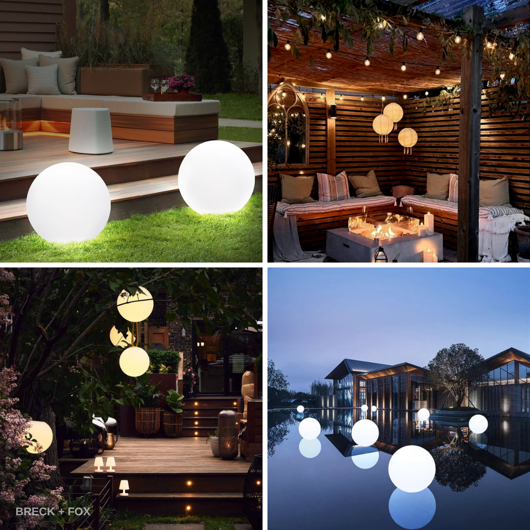
The grid only reads as a single world if every image shares the same colour temperature, contrast and grade. Warm wood and cream, dusk blues and warm light, black and red studio tones. One off-palette photo breaks the spell and the whole thing becomes a random collage.
Mix scales on purpose
Alternate wide shots, mid shots and extreme close-ups: the room, the piece in the room, the grain of the wood. The change in scale is what makes the eye move around the grid instead of stopping on one tile. Nine mid shots in a row feel like a product catalogue.
Include the source, the craft and the result
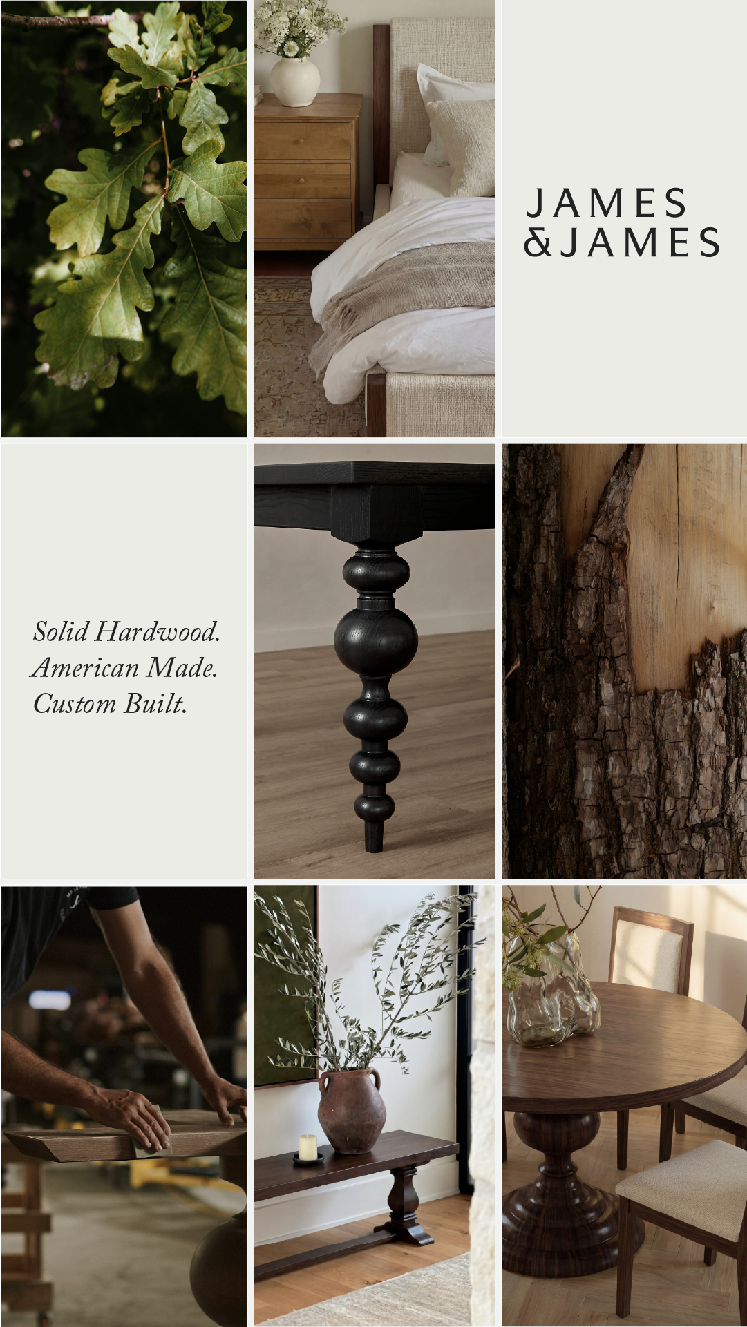
The strongest moodboards tell a quiet story in images alone: where it comes from (leaves, raw bark), how it's made (hands sanding, instructor coaching), and where it ends up (the finished room, the class laughing together). Each tile answers a different question the buyer has.
Give the brand and the promise their own tiles
Replace one or two photos with flat colour tiles holding the wordmark and a short three-part line ("Solid Hardwood. American Made. Custom Built."). This gives the eye a rest, anchors the brand inside the grid, and makes the claims feel like part of the curation rather than an overlay.
People should be doing, not posing
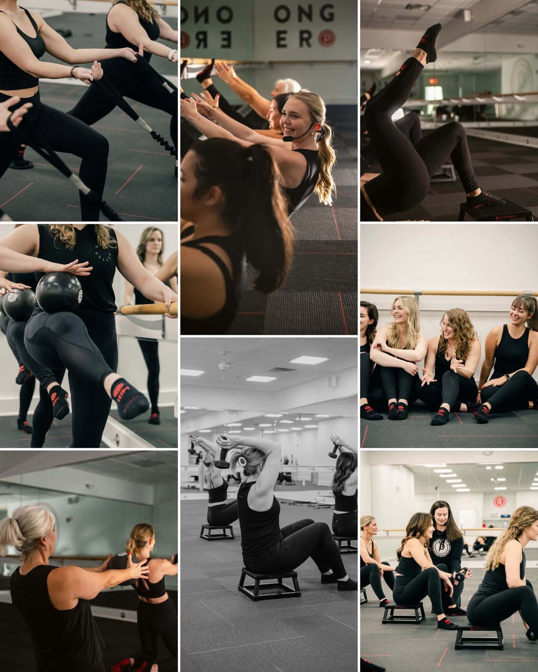
Real movement, candid laughs, hands at work, slightly off-centre framing. Posed smiles to camera turn the board into stock photography. For services, gyms and experiences, candid group shots are the proof that it feels good to be there.
Grid structure matches the brand
Clean equal tiles with white gutters feel premium and calm. Offset, staggered tiles feel energetic and social. Four large tiles feel bold and simple. Choose the grid for the feeling, not for how many photos you have.
Let it breathe in the feed
No headline across the top, no CTA button in the image, no price sticker. The moodboard's job is to make someone want to be in that world; the primary text and CTA do the rest. Adding sales elements drags it back into looking like an ad.
Reference 1
AI Edit Master Prompt
Using the attached image as the layout reference: keep the tall three-by-three grid of equal rectangular tiles with narrow off-white gutters. Fill it with warm, natural-light photographs in a muted earthy palette of wood browns, soft greens and cream: a close-up of leaves in dappled light in the top left, a styled bedroom showing the product in use in the top middle, a flat pale tile with a spaced-out all-caps serif wordmark in the top right, a flat pale tile with three short italic serif lines in the middle left, a detailed close-up of a turned wooden furniture leg in the centre, a raw bark-and-timber texture close-up in the middle right, hands sanding wood in a dim workshop in the bottom left, a styled console with a vase and branches in the bottom middle, and a round table set with chairs in soft window light in the bottom right. Replace the product shots with {YOUR PRODUCT IN USE}, {YOUR PRODUCT DETAIL} and {YOUR CRAFT PROCESS}. Set the wordmark tile to "{YOUR BRAND}" and the text tile to "{THREE SHORT PROOF POINTS}".Reference 2
AI Edit Master Prompt
Using the attached image as the layout reference: keep the square two-by-two grid of equal photographs with thin white gutters, all shot at dusk or night with a warm glow against deep blues and greens. Show the product in four different settings: on a lawn beside a lit terrace in the top left, as part of a cosy candlelit covered seating area in the top right, hanging among trees in a planted garden in the bottom left, and floating on a reflective pool in front of modern architecture in the bottom right. Keep a small white wordmark in the lower-left corner of the bottom-left tile. Replace the product in every tile with {YOUR PRODUCT}. Set the wordmark to "{YOUR BRAND}".Reference 3
AI Edit Master Prompt
Using the attached image as the layout reference: keep the tall staggered collage of rectangular photographs in three columns with thin white gutters, the tiles offset at different heights so no rows line up. Fill it with candid photographs of a group session in a bright studio with mirrors, bars and dark flooring, everyone in dark activewear with a single accent colour on small details: close-ups of limbs mid-exercise, a smiling instructor with a headset leading the group, a leg lifted in motion, a movement at the bar with equipment, a black-and-white shot of a class seated on low steps, a group sitting on the floor laughing together, and an instructor coaching someone one-to-one. Keep a mix of tight crops and wider shots, with natural candid expressions and slight motion. Replace the setting and activity with {YOUR SERVICE IN ACTION}, and the accent details with {YOUR BRAND COLOUR}.