
News & Advertorial
- Format
- Static
- Category
- Social Proof
- Stage
- TOF
- Requires
- Prompt only
What is it
An ad built to look like a news article, magazine feature or review — masthead, headline, byline, article typography — so the claim reads as coverage rather than a pitch. The product sits inside the layout as if a journalist chose to write about it.
What makes it work
The masthead does the work before anything is read
A logo bar at the top, caught in peripheral vision, is what shifts the brain from ad mode to news mode. Everything below it inherits that framing.
Write the headline like a reporter, not a marketer
Third person, curiosity gap, no CTA. "Shoppers rave over the £19 hack" reads as a story. "Buy now and save 20%" breaks the illusion in one line.
Add the article furniture
Byline, timestamp, nav tabs, a category label, a blue or red hyperlink in the body text. These small signals are what tip a graphic into a page.
Match the outlet's status to the price tier
Everyday impulse product, tabloid energy. Premium product, glossy or business title. A luxury masthead over a $9 item curdles the halo into something that reads fake.
Ground the product photo
This is the one element that must look real rather than rendered — a studio or in-context shot. A floating cutout inside an article layout collapses the whole thing.
Reference 1
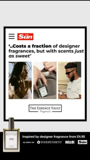
AI Edit Master Prompt
Using the attached image as the layout reference: keep the light background with a framed article card inside a thick black border, a masthead bar at the top with a menu icon, a bold italicised quote headline beneath it, a triptych of three photos of different people using the product, a logo block below them, the product overlapping the bottom left corner of the frame, and a black banner across the base with a price line and a row of small logos. Replace the photos with {PEOPLE USING YOUR PRODUCT} and the product with {YOUR PRODUCT}. Set the masthead to "{YOUR OUTLET}", the headline to "{THE QUOTE}", the logo block to "{YOUR BRAND}", and the base banner to "{THE PRICE LINE}" with your own earned logos.Reference 2
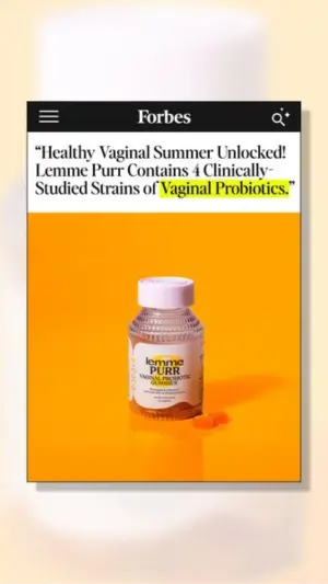
AI Edit Master Prompt
Using the attached image as the layout reference: keep the soft blurred gradient background with a vertical white article card centred and casting a drop shadow, a black masthead bar at the top with a menu icon and a search icon, a bold serif headline in quotes beneath it with the key phrase highlighted in yellow marker, and a large square photo of the product on a saturated background filling the lower half. Replace the product with {YOUR PRODUCT}. Set the masthead to "{YOUR OUTLET}" and the headline to "{THE EDITORIAL CLAIM}".Reference 3
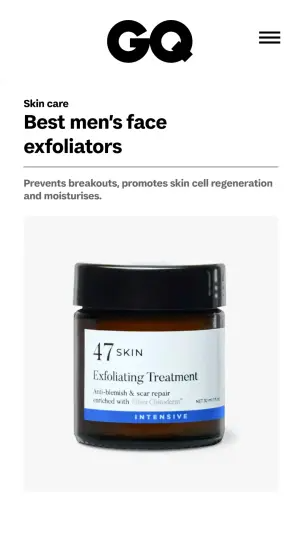
AI Edit Master Prompt
Using the attached image as the layout reference: keep the clean white mobile article layout with a large wordmark centred at the top beside a menu icon, a small category label, a bold two-line headline, a thin divider, a line of body text beneath it, and a simple studio product photo filling the lower half on a light grey background. Replace the product with {YOUR PRODUCT}. Set the wordmark to "{YOUR OUTLET}", the category to "{THE CATEGORY}", the headline to "{THE ROUNDUP TITLE}", and the body line to "{WHAT IT DOES}".Reference 4
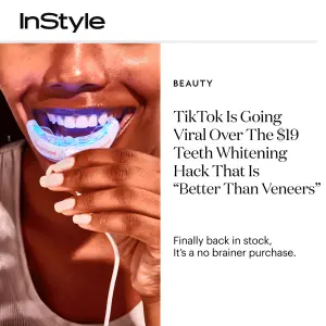
AI Edit Master Prompt
Using the attached image as the layout reference: keep the vertical split with a close-up photo of the product in use on the left and a white editorial column on the right, the wordmark in the top left corner, and in the column a small category label, a large serif headline in three or four lines, and a short subline beneath it. Replace the photo with {YOUR PRODUCT IN USE}. Set the wordmark to "{YOUR OUTLET}", the category to "{THE CATEGORY}", the headline to "{THE TREND HOOK}", and the subline to "{THE AVAILABILITY LINE}".Reference 5
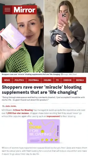
AI Edit Master Prompt
Using the attached image as the layout reference: keep the full news-site layout: a masthead bar with a menu icon top left, a split photo pair across the top with a small grey caption strip beneath it, a row of coloured navigation tabs, a bold black headline, an italic subheadline in quotes, a byline, and a paragraph of body text containing a coloured hyperlink, with a product photo below. Replace the photos with {YOUR PRODUCT IN USE} and {THE RESULT}. Set the masthead to "{YOUR OUTLET}", the nav tabs to "{SECTION NAMES}", the headline to "{THE STORY}", the subheadline to "{THE CUSTOMER QUOTE}", the byline to "{THE WRITER}", and the body to "{THE ARTICLE OPENING}".Reference 6
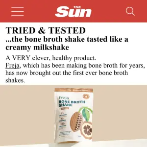
AI Edit Master Prompt
Using the attached image as the layout reference: keep the white mobile article layout with a solid colour masthead bar at the top containing a menu icon, a wordmark and a search icon, a bold caps kicker line beneath it, a two-line headline, a short paragraph of body text with one word underlined as a link, and a product photo on a plain surface below. Replace the product with {YOUR PRODUCT}. Set the masthead to "{YOUR OUTLET}", the kicker to "{THE VERDICT LABEL}", the headline to "{THE VERDICT}", and the body to "{THE OPENING LINE}".