Push Notification
- Format
- Static
- Category
- Native & UI Mimicry
- Stage
- TOF
- Requires
- Prompt only
What is it
An ad built to look like a system alert: an iOS banner, a lock-screen message stack, or a pop-up with buttons. People are trained to check a notification the moment it appears, so the ad gets read before the brain registers it's an ad. The format borrows the priority of a real alert, and that priority has to be paid back with something worth the interruption.
What makes it work
Make the banner look native
Correct corner radius, soft shadow, system type weight, a timestamp in the corner. The reflex only fires for alerts that look like real alerts. A banner that looks designed loses the reflex and just becomes a busy ad.
Choose the sender for the emotion you want
A brand name reads as a promo. "Bestie" reads as a friend who can't wait to tell you. "Order Update" reads as something you already started. The sender decides how the message lands before the offer is read.
Make the payoff match the alarm
The stronger the urgency, the better the offer needs to be. A gentle banner can carry a soft discount. A red-badge, heart-rate-spiking alert that delivers "10% off" feels like a con and breeds resentment instead of clicks.
Don't steal the reflex
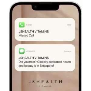
Fake missed calls and fake emergency alerts pull the best CTR in the account, then the hide-rate and negative feedback climb and Meta prices that into your CPM. Borrow urgency you can repay; don't take urgency you can't.
Make the buttons emotional choices
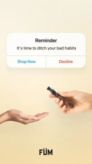
"Shop Now / Decline" is invisible. "I'm ready to quit / I like my bad habits" forces a small identity choice, and the "no" option is uncomfortable to tap.
Use the timestamp
"11:11" catches the eye with the make-a-wish superstition. "2:14 AM" reads as a friend who couldn't wait until morning. Both beat a neutral mid-afternoon time, because the time itself tells a small story.
Reference 1
AI Edit Master Prompt
Using the attached image as the layout reference: keep the soft pastel gradient background, a white iOS system alert box near the top with a bold centred header, one line of subtext, and two text buttons split by a thin divider, the left in blue and the right in red. Keep the two hands reaching in from opposite sides of the frame, one offering the product to the other open, empty hand, and a small bold logo at the bottom centre. Replace the product with {YOUR PRODUCT} and the logo with {YOUR LOGO}. Set the header to "{THE REMINDER}", the subtext to "{THE NUDGE}", and the buttons to "{THE YES CHOICE}" / "{THE UNCOMFORTABLE NO}".Reference 2
AI Edit Master Prompt
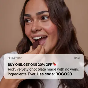
Using the attached image as the layout reference: keep the warm lifestyle photo of a smiling person biting into the product against a solid tan background, and a crisp white iOS banner notification overlaid across the lower third with a small sender name in the top left and "now" in the top right, a bold caps offer line with one emoji, a line of regular body text, and a bold code line at the end. Replace the person and product with {A PERSON ENJOYING YOUR PRODUCT}. Set the sender to "{YOUR BRAND}", the offer line to "{THE OFFER}", the body to "{THE BENEFIT}", and the code line to "{THE CODE}".Reference 3
AI Edit Master Prompt
Using the attached image as the layout reference: keep the white iPhone frame with a notch and a soft beige blurred wallpaper, two frosted notification banners stacked in the upper half — the first with a green phone icon, a small "PHONE" label, the brand name in bold and a missed-call line, the second with a green messages icon, a small "MESSAGES" label, the brand name in bold and a two-line message — and a spaced-out wordmark logo in the lower half. Replace the logo with {YOUR LOGO}. Set the sender names to "{YOUR BRAND}", the first line to "{THE ALERT}", and the message to "{THE NEWS}".Reference 4
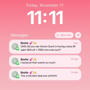
AI Edit Master Prompt
Using the attached image as the layout reference: keep the smooth pink gradient lock screen with the date in white text at the top and a massive bold white time beneath it, a "Messages" label with "Show less" and close buttons, and a stack of three frosted message notifications from the same contact, each with a grey initial avatar with a small green messages badge, the contact name followed by two emojis, a timestamp on the right, and a short message line. Set the date to "{THE DATE}", the time to "{THE LOADED TIMESTAMP}", the contact to "{THE FRIEND PERSONA}", and the three messages to "{THE OFFER}" / "{THE ENDORSEMENT}" / "{THE PUSH}".