Split Screen
- Format
- Static, Video
- Category
- Problem / Solution
- Stage
- TOF, MOF
- Requires
- A real contrast worth drawing
What is it
The frame divided down the middle — usually vertically, sometimes horizontally — with one state on each side and a hard edge between them. Unlike before/after, the two halves don't have to be the same subject at two moments in time: they can be a problem and a product, an assumption and a fact, a price and a value, two roles in the same transaction. The split does the argument structurally, so the viewer understands the claim before reading a single word.
What makes it work
The divide has to be visible from the thumbnail
Hard edge, colour change, or two distinctly different photographic treatments. A soft gradient or a subtle tonal shift reads as one messy image at feed size, and the whole mechanism collapses. If someone can't tell it's two panels at 30% scale, it isn't a split screen yet.
Give each side exactly one job
One label, one image, one idea per panel. The format's power is that the eye can compare two things at once — the moment either side carries three bullets and a sub-headline, that parallel read breaks and it becomes two ads stacked next to each other.
Write the two labels as one sentence
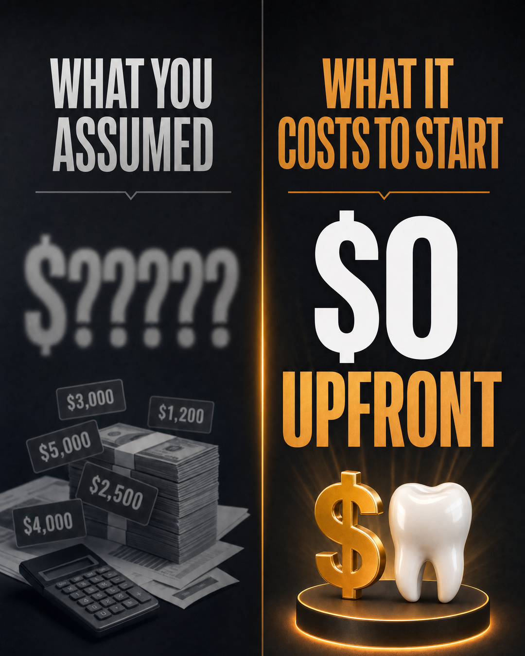
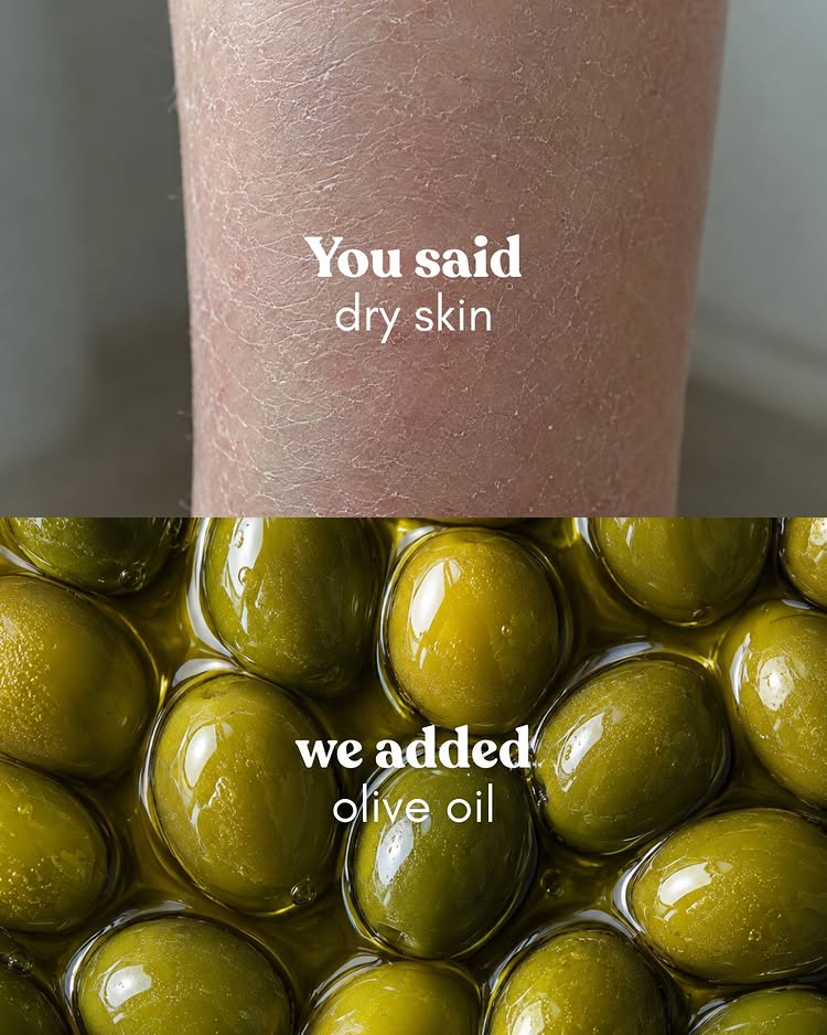
"You said / we added." "What you assumed / what it costs to start." "The problem / the solution." The left label sets up a grammatical expectation that the right label completes, which is what pulls the eye across the divide. Two independent headlines sitting side by side don't pull at all.
Make the right side unambiguously better-looking
Warmer, brighter, cleaner, more appetising, better lit. Viewers read visual quality as argument before they read the words, so a dim, cluttered solution panel undermines the copy no matter how good the claim is. Shoot or source the two halves with different intent, not the same intent twice.
Left is where they are, right is where you take them
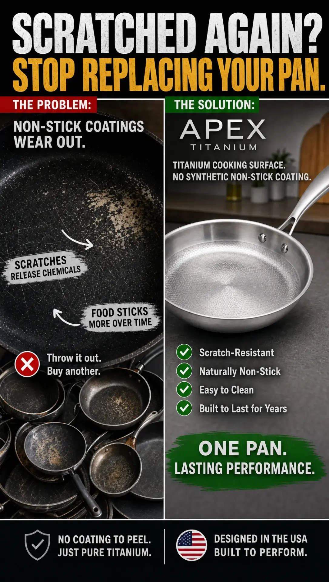
In left-to-right reading markets the eye lands left first, so the left panel should be the recognisable present — the tired pan, the soft dinner, the assumed price. Inverting it costs you the narrative for no gain. Vertical splits follow the same logic top to bottom.
Don't split things that aren't actually opposed
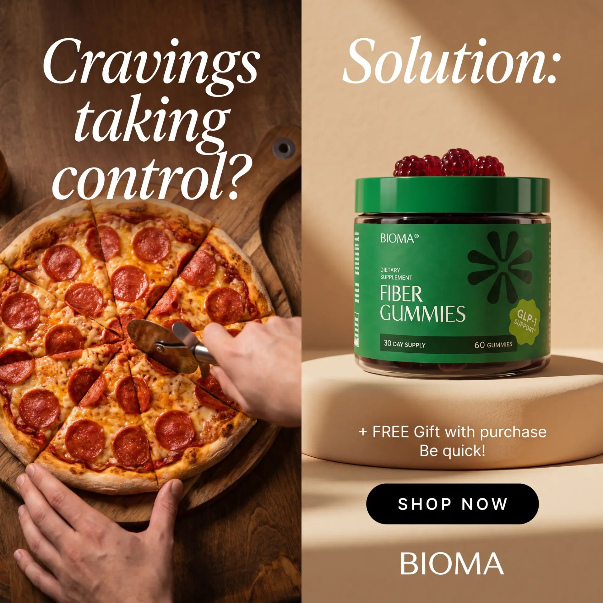
The format asserts a contrast whether one exists or not, so a weak pairing reads as manipulation. Pizza vs. supplement works because one causes the need for the other. Two neutral product shots either side of a line just look like a carousel that failed to load.
A shared element across the divide keeps it as one ad
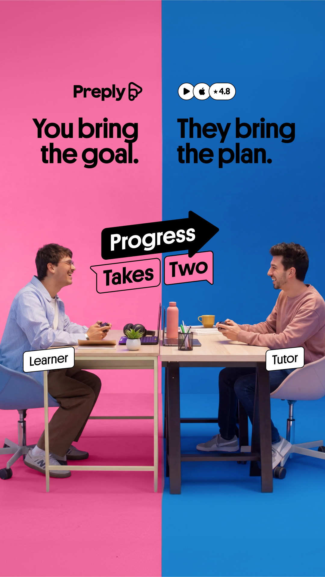
A desk that continues across both halves, a circular badge straddling the line, a single headline running the full width above both panels. Something has to stitch the two sides together or the composition reads as two crops rather than one argument.
Reference 1
AI Edit Master Prompt
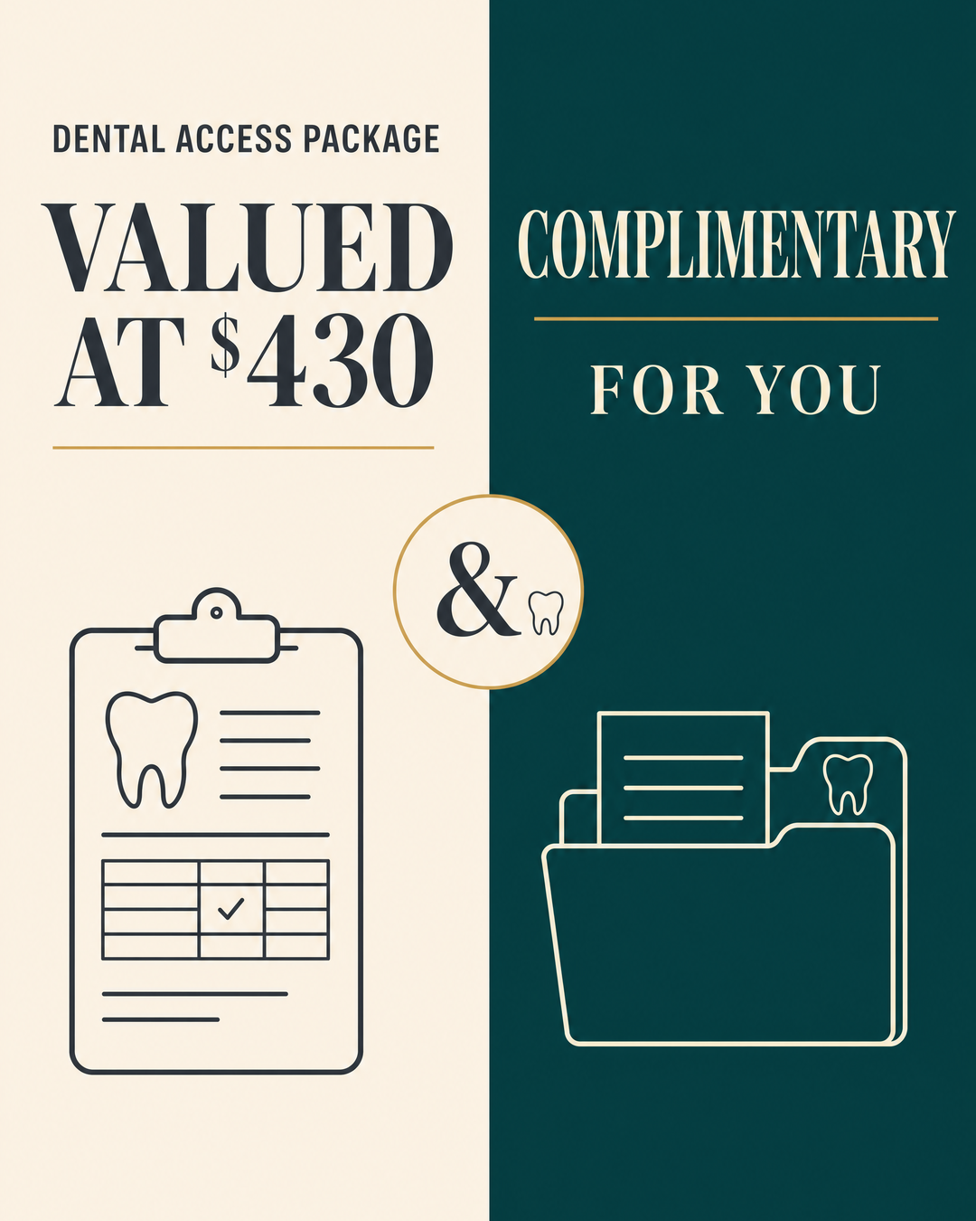
Using the attached image as the layout reference: keep the vertical split with a warm cream left half and a deep green right half, a small all-caps eyebrow line at the top of the left side above a large dark serif headline with the price figure picked out in a lighter tone, a thin gold rule beneath it, and a simple line illustration in the lower half of each panel. Keep a circular cream badge with a gold ring straddling the centre divide, containing a large ampersand and a small icon. On the right side keep a cream serif headline on two lines with a gold rule between them. Replace the illustrations with {YOUR LEFT ILLUSTRATION} and {YOUR RIGHT ILLUSTRATION} and the badge icon with {YOUR ICON}. Set the eyebrow to "{THE PACKAGE NAME}", the left headline to "{THE PERCEIVED VALUE LINE}" with {THE PRICE} highlighted, and the right headline to "{THE ACTUAL OFFER}".Reference 2
AI Edit Master Prompt
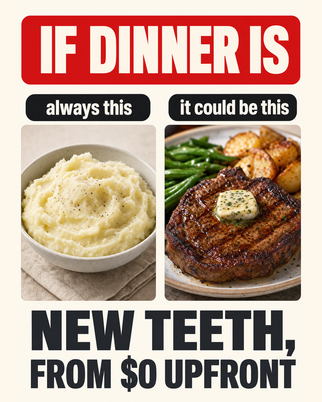
Using the attached image as the layout reference: keep the warm off-white background, the large red rounded rectangle across the top containing a huge white condensed all-caps headline, two dark rounded pill labels beneath it side by side in white type, and two food photographs below — a plain, soft-looking dish on the left and a rich, appetising plated dish on the right. Keep the very large black condensed all-caps two-line headline filling the bottom of the frame. Replace the dishes with {THE CURRENT MEAL} and {THE UPGRADED MEAL}. Set the top banner to "{THE SETUP LINE}", the pills to "{THE CURRENT LABEL}" and "{THE POSSIBILITY LABEL}", and the bottom headline to "{THE OFFER LINE}".Reference 3
AI Edit Master Prompt
Using the attached image as the layout reference: keep the dark charcoal background split vertically by a glowing orange light seam. On the left keep a grey condensed all-caps headline with a small underline flourish, a huge heavily blurred dollar-and-question-marks figure beneath it, and a desaturated photographic pile of cash with floating price tags and a calculator. On the right keep an orange condensed all-caps headline, a massive white dollar-zero figure, an orange all-caps line beneath it, and a glossy 3D dollar symbol next to a white product object on a small gold-lit pedestal with light rays behind. Replace the cash pile with {THE ASSUMED COST SCENE} and the pedestal object with {YOUR PRODUCT}. Set the left headline to "{THE ASSUMPTION}", the right headline to "{THE REALITY}", the big figure to "{THE REAL PRICE}", and the line beneath to "{THE QUALIFIER}".Reference 4
AI Edit Master Prompt
Using the attached image as the layout reference: keep the horizontal split across the middle with a hard edge. The top half is an extreme close-up photograph of the problem texture with short white serif text centred over it — a bold first line and a lighter second line. The bottom half is a rich, glossy macro photograph of the ingredient with matching white serif text centred over it, bold first line and lighter second line. Replace the top photo with {THE PROBLEM CLOSE-UP} and the bottom photo with {YOUR INGREDIENT MACRO}. Set the top text to "{WHAT THEY TOLD YOU}" and the bottom text to "{WHAT YOU ADDED}".Reference 5
AI Edit Master Prompt
Using the attached image as the layout reference: keep the black banner across the top with a distressed white condensed all-caps question line above a yellow condensed all-caps answer line. Below it keep the vertical split: the left panel has a red corner label reading "THE PROBLEM:", a white all-caps line, a dark photo of the worn-out alternative with two white scribble-style callout labels and arrows, a red circle with a white X, a short verdict line, and a photo of discarded alternatives at the bottom. The right panel has a green corner label reading "THE SOLUTION:", a spaced-out product wordmark, a short spec line, a clean studio product photo, four green-checkmark benefit bullets, and a green brushstroke badge with a white all-caps claim. Keep the bottom footer bar split into two cells with a badge icon and two-line caption each. Replace the photos with {THE WORN ALTERNATIVE} and {YOUR PRODUCT}. Set the banner to "{THE PAIN QUESTION}" and "{THE STOP LINE}", the problem lines to "{THE FLAW}" with callouts "{FLAW CONSEQUENCE 1}" and "{FLAW CONSEQUENCE 2}", the verdict to "{THE OLD VERDICT}", the bullets to "{FOUR BENEFITS}", the brushstroke claim to "{THE DURABILITY PROMISE}", and the footer cells to "{TRUST CLAIM 1}" and "{TRUST CLAIM 2}".Reference 6
AI Edit Master Prompt
Using the attached image as the layout reference: keep the vertical split with a saturated pink left half and a saturated blue right half, two people seated at desks facing each other across the divide as if at one shared desk, each with a small white rounded name tag near them. Keep the brand wordmark top-left, a small row of white rating pills top-right, a bold black headline at the top of each half, and a cluster of sticker-style chat bubbles in the centre straddling the divide — a black arrow-shaped bubble and two outlined bubbles in contrasting colours. Replace the people with {YOUR TWO ROLES}. Set the headlines to "{WHAT ONE SIDE BRINGS}" and "{WHAT THE OTHER SIDE BRINGS}", the bubbles to "{THE SHARED OUTCOME PHRASE}", the name tags to "{ROLE ONE}" and "{ROLE TWO}", and the wordmark to "{YOUR BRAND}".Reference 7
AI Edit Master Prompt
Using the attached image as the layout reference: keep the vertical split with a warm, dark overhead photograph of the craving food on the left with a large white italic script headline over it, and a soft cream right half with a matching white italic script headline at the top, your product standing on a rounded pedestal in the centre, a small two-line offer caption beneath it, a black rounded button, and a thin spaced-out brand name at the bottom. Replace the food with {THE CRAVING} and the product with {YOUR PRODUCT}. Set the headlines to "{THE CRAVING QUESTION}" and "{THE SOLUTION WORD}", the caption to "{THE GIFT OFFER}", the button to "{THE CTA}", and the brand name to "{YOUR BRAND}".