
Text on Things
- Format
- Static, Video
- Category
- Pattern Interrupts
- Stage
- TOF
- Requires
- An object with a reason to be in frame
What is it
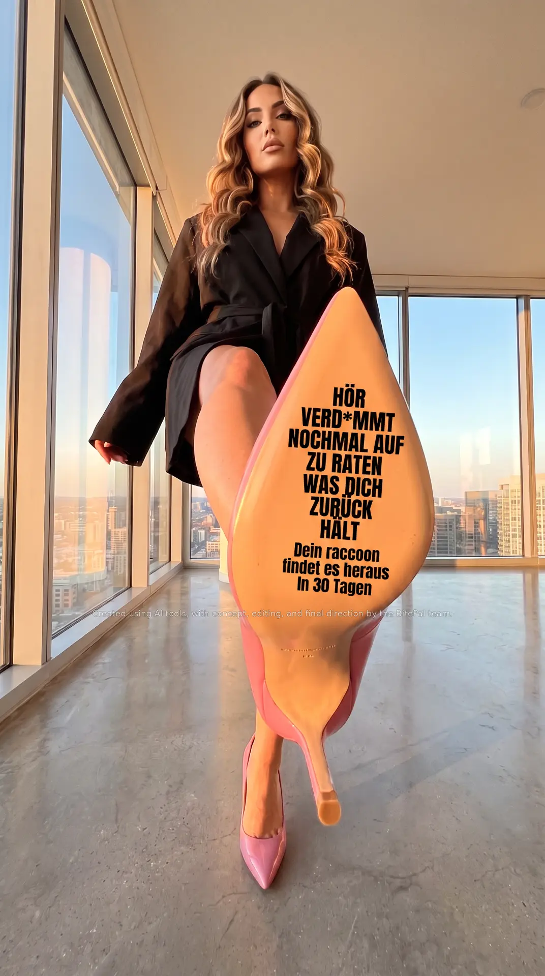
The message printed, stamped or written onto a physical object inside a real-looking scene: the sole of a shoe, a coffee cup sleeve, a receipt, a cake, a towel, a car windscreen, a pizza box lid. The object carries the copy the way a billboard would, but because it's part of a photograph rather than an overlay, the eye reads it as something that exists in the world. The surprise of text appearing where text shouldn't be is the hook, and the object itself adds a second layer of meaning to the line.
What makes it work
The object should mean something on its own
A shoe sole about to step on something says "stop" or "enough." A receipt says "the cost." A mirror says "you." The best versions pick a surface whose built-in meaning sharpens the line. A random object with text on it is just a sign in a strange place.
The text has to sit on the surface, not float over it
It follows the object's curve, perspective and lighting, picks up its texture, and is partly shaded where the object is. Flat text pasted on top of a photo is the most common failure of this format, and it's the first thing viewers notice.
Make the surface the biggest thing in frame
Push the object toward the camera: a wide-angle, low shot with the sole almost filling the frame, a macro of the cup sleeve, the receipt held close to the lens. Scale is what makes the copy readable and gives the image its punch.
The scene sets the attitude
Everything around the object tells you how to read the line. A confident person in a penthouse makes a blunt headline feel empowering. A messy kitchen makes the same line feel relatable. Choose the setting for the tone of the copy, not just to look good.
Short, blunt, then the answer
A heavy all-caps line that challenges or provokes, followed by one smaller line with the product and the timeframe. The object's surface only has room for two thoughts, and that constraint keeps the copy honest.
Watch what the pose and framing imply
Low angles, body-focused framing and dominant poses can tip from "confident" into something Meta's reviewers read as sexually suggestive, and that gets ads limited or rejected even when nothing explicit is shown. Keep the attitude in the expression and the copy rather than in the body framing.
Disclose AI where it's used
When the scene or person is generated, keep a small, readable disclosure line in the frame, as this reference does. It's increasingly expected on Meta, it's required under the EU AI Act for realistic synthetic images of people, and it stops a lifelike model being mistaken for a real endorsement.
Reference 1
AI Edit Master Prompt
Using the attached image as the layout reference: keep the dramatic low-angle wide-lens photograph taken from floor level in a bright high-rise interior with floor-to-ceiling windows, a city skyline at golden hour and a polished concrete floor. Keep a confident adult model in a dark oversized blazer standing tall and looking straight down at the camera with a composed expression, one leg raised toward the lens so the underside of the shoe fills most of the lower-centre of the frame, the sole enlarged by perspective and the other foot planted on the floor behind. On the sole keep a heavy condensed all-caps headline in black printed across the widest part on seven short centred lines, and beneath it three shorter lines in a lighter weight, all following the curve and texture of the sole. Keep a small faint white disclosure line across the frame just below the text. Replace the model with {YOUR MODEL} and the shoe with {YOUR SHOE OR SURFACE}. Set the headline to "{THE BLUNT CHALLENGE}", the smaller lines to "{YOUR PRODUCT} {WHAT IT DOES} {THE TIMEFRAME}", and the disclosure line to "{YOUR AI DISCLOSURE}".